Brand & Communication · Local Food
The Texas Chili Queens founder Ed pulled together his San Antonio roots and LGBTQ+ advocacy to bring the Texas Chili Queens food truck to life. We built a brand identity to celebrate the spirit of the operation — hand-drawn lettering, a lasso-shaped Q, and a cohesive brand system that shaped the truck's artwork, menus, cards, and everything in between.
The Ask
Ed didn't want a generic food-truck logo. Texas Chili Queens carries San Antonio heritage on one side, drag-culture warmth on the other, and a stake in the ground for a food business that reflects both. The brand had to earn all of that — not just decorate a truck.
The challenge: no off-the-shelf typeface could hold both "Texas Chili" and "(drag) Queens" at once without leaning too far in one direction. If the mark was going to work, it needed to be built from scratch.
The Approach
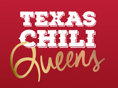
We couldn't find a typeface that captured both "Texas Chili" and "Queens" — so we hand-drew it. In lipstick. On a mirror. The Q became a lasso: a piece of typographic sleight-of-hand that marries the two ideas in a single glyph.
Paired the hand-drawn "Queens" with a distressed slab-serif "Texas Chili," anchored in a deep chili-cayenne red with a metallic-gold shimmer. Warm, unapologetic, and unmistakably its own.
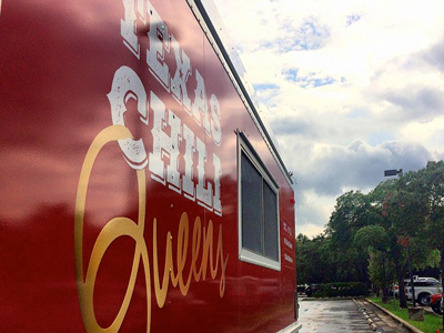
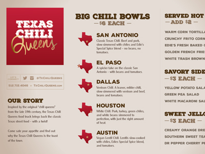
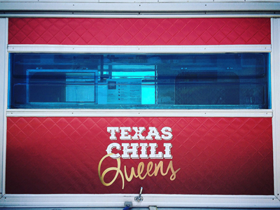
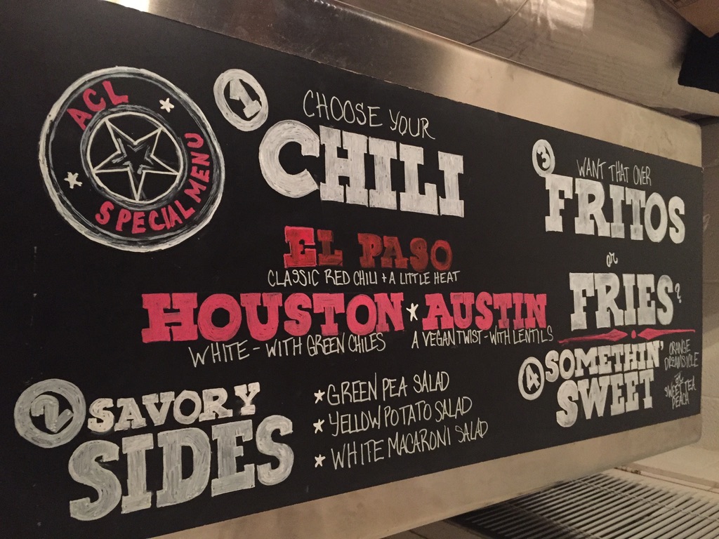
The identity was built to travel. A cohesive visual system across the vinyl-wrapped mobile storefront, the menu cards, gold-foil-stamped business cards, website, and merch — one language, wherever the truck rolled up.
The best small-business brands aren't just designed for the founder — they carry the founder. Every choice in the TCQ system, from the lasso Q to the metallic gold, pointed back to Ed and the story he was telling with the truck.
When the typeface doesn't exist, you draw it. In lipstick. On a mirror.
The most fun the studio has had inventing a mark
The Outcome
What Made It Work
The lasso Q. The lipstick-on-mirror lettering. The metallic gold. Every choice reinforced the story — nothing was decoration for decoration's sake.
Font libraries are enormous. Sometimes none of them fit. Drawing the mark by hand was faster than compromising with something almost-right.
Food-truck branding lives on wheels. Every application — cards, menus, wrap — was engineered to hold up in situ, in daylight, in motion, at a distance and up close.
Selected Artifacts