Product & Experience · Technical Community
Microsoft's Tech Community had grown into a sprawl its own members couldn't navigate — a wall of content where the thing you needed was buried under everything you didn't. The brief was relevance: help millions of IT pros, developers, and admins find their people and their answers fast. We led human-centered design to reimagine wayfinding and personalization for the Khoros Community Experience Group.
The Ask
As North American UX Lead for the Khoros Professional Services Community Experience Group, we routinely led engagements customizing the Community product for Tier 1 brands — Microsoft, Google, Visa, GM, Samsung, and Sephora. Microsoft's ask was one of the hardest: a single community serving millions of wildly different people, from a first-time product user to a seasoned systems admin who lives in the platform daily.
Signed-in members had the worst of it. They had no mental model of how the community was organized, so the content meant for them — the answer, the space, the person worth following — was lost in the noise.
Through both quantitative and qualitative research, my team found the problem was never a shortage of content. It was that no one could find the content meant for them. This was a wayfinding and relevance problem wearing an engagement problem's clothes.
The Approach
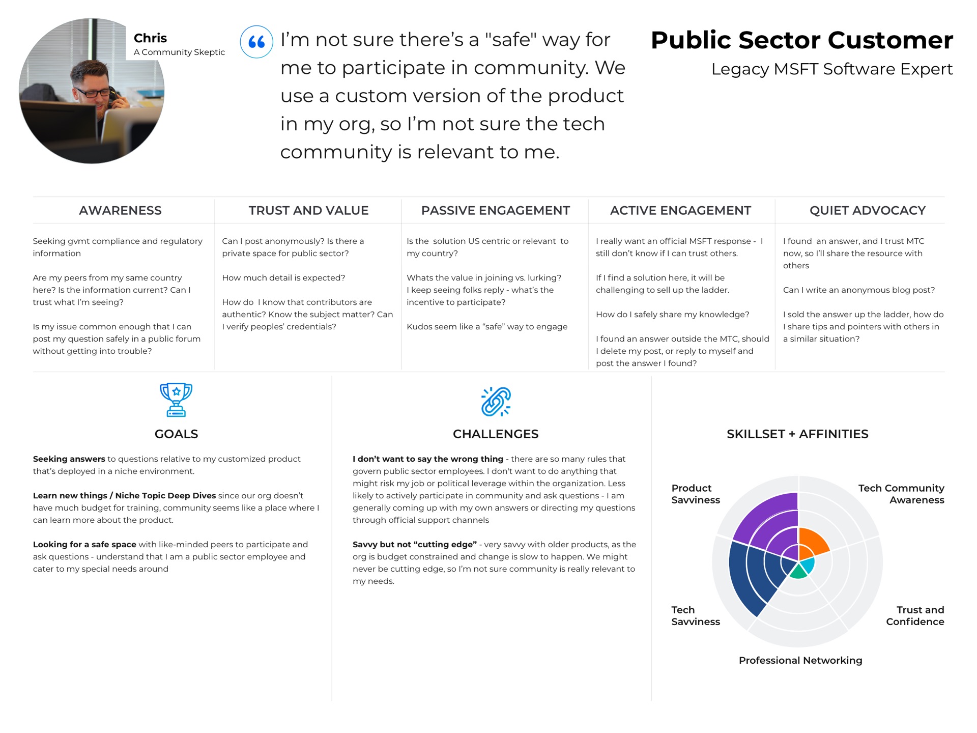
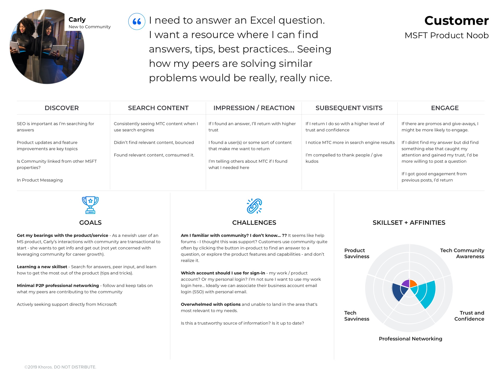
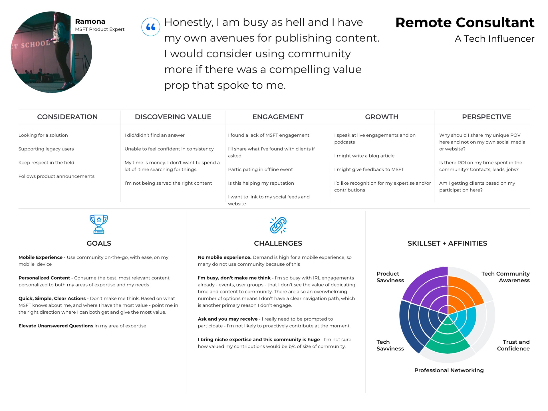
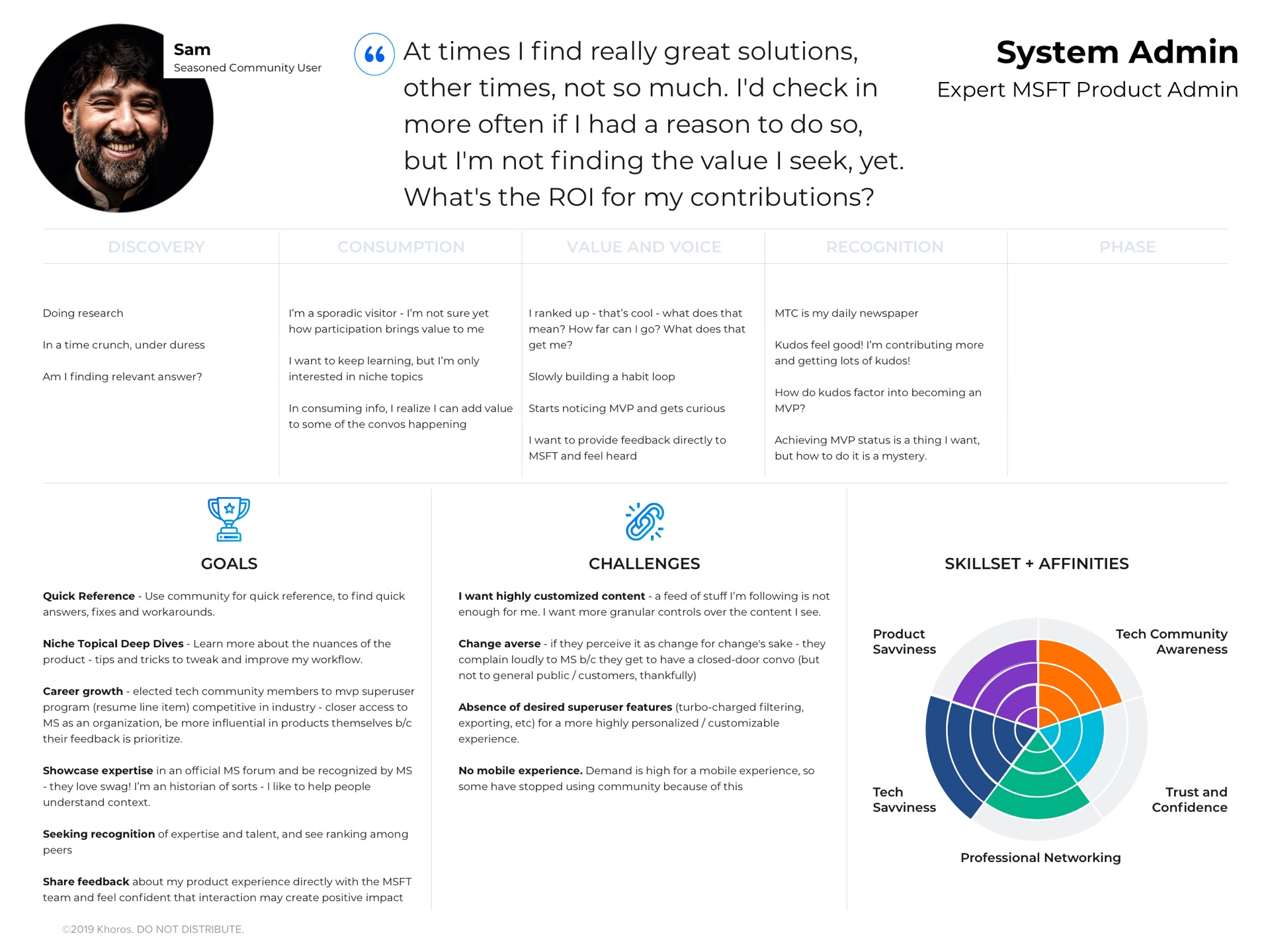
We built four research-based archetypes — the skeptic, the newcomer, the influencer, and the sysadmin — each with a full journey map and a skill-and-affinity radar. Personalization has to start with knowing exactly who you're personalizing for, so every decision downstream answered to a real person and a real moment, not an average user who doesn't exist.
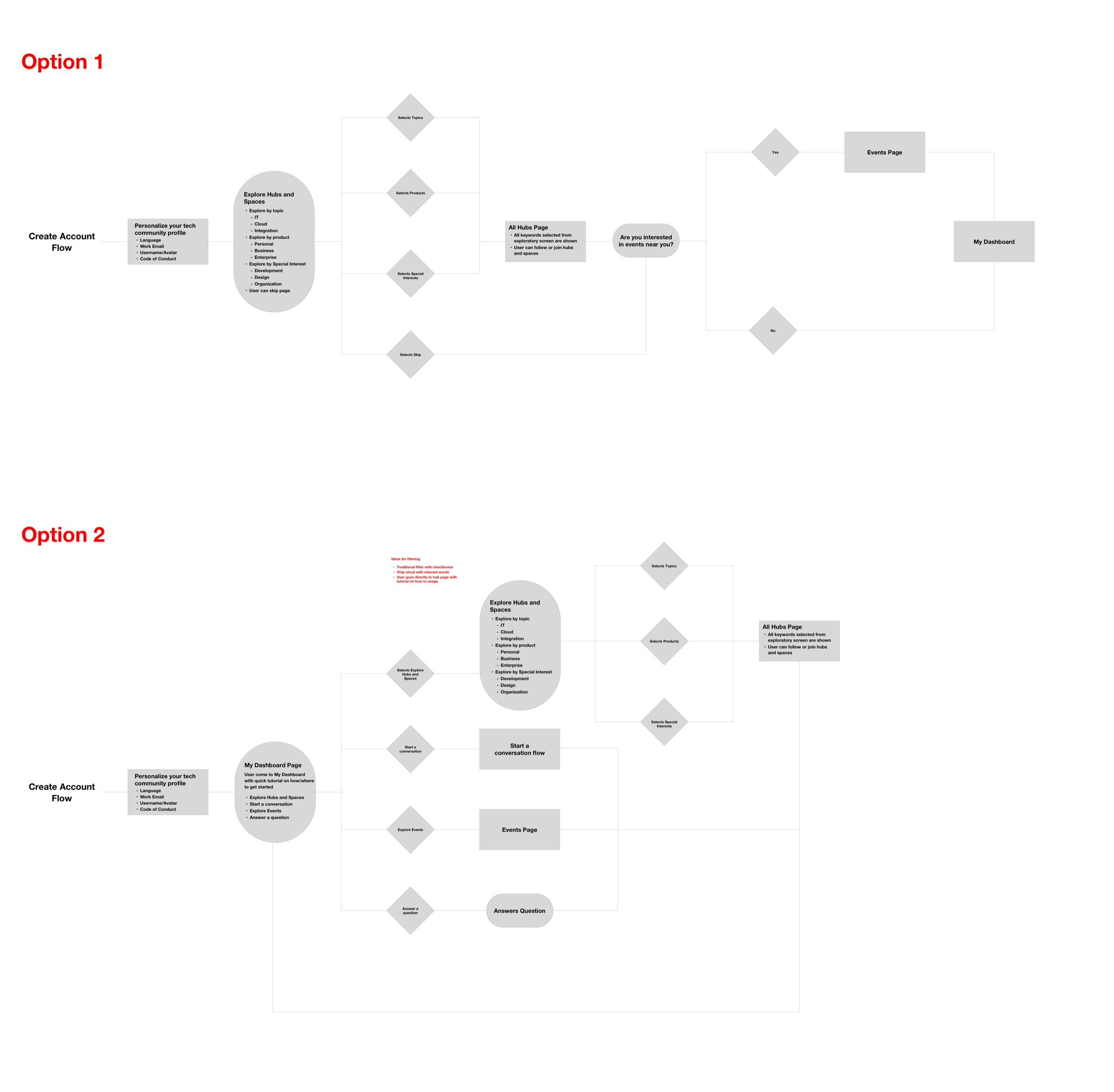
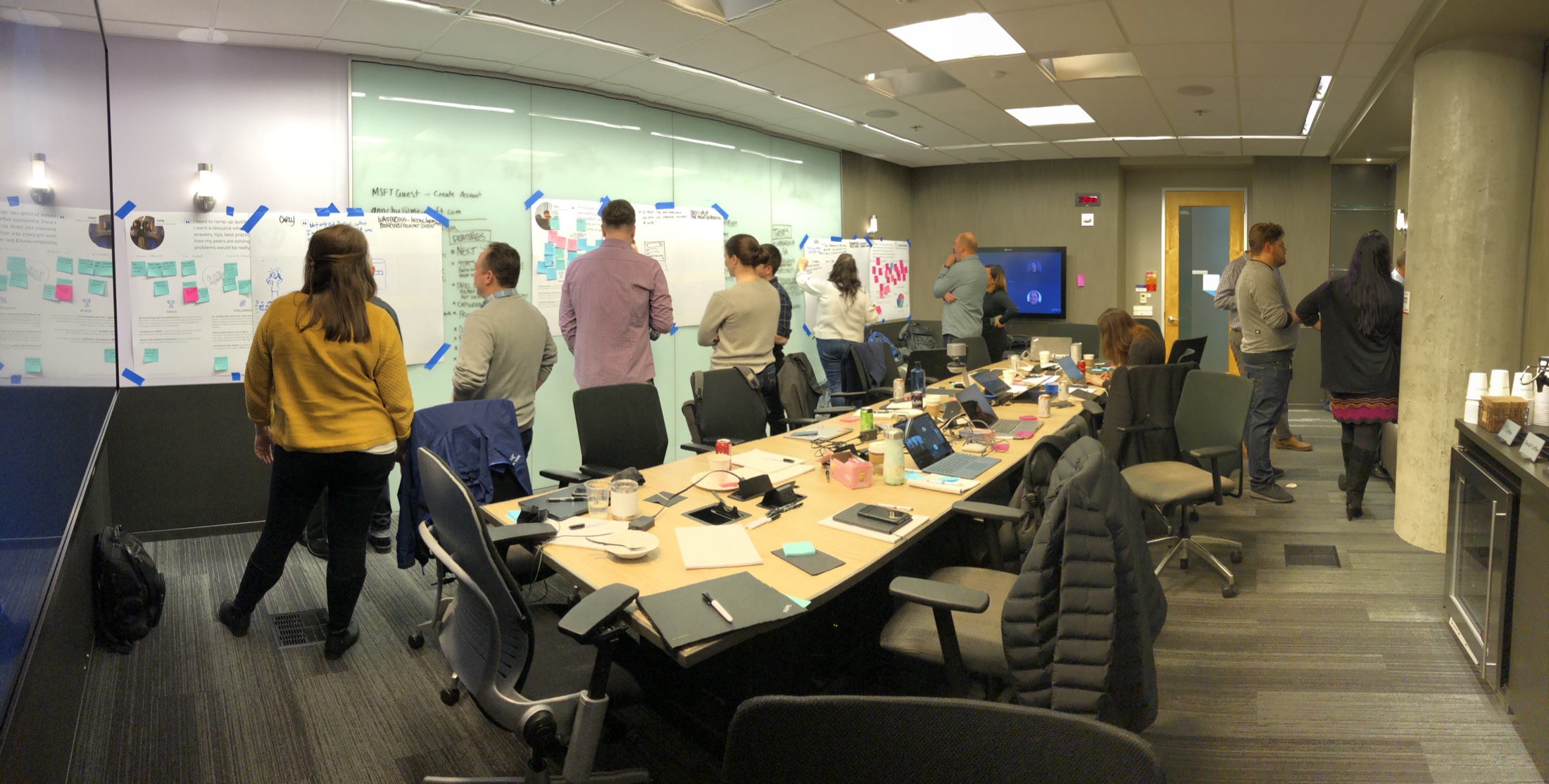
A gallery-walk workshop got the whole team looking at the same possibilities at once. We storyboarded key moments across the archetypes and aligned on a shared vision for wayfinding — cleaner primary navigation and hierarchy, clearer context clues, and content personalized to the products and journeys each member actually cared about.
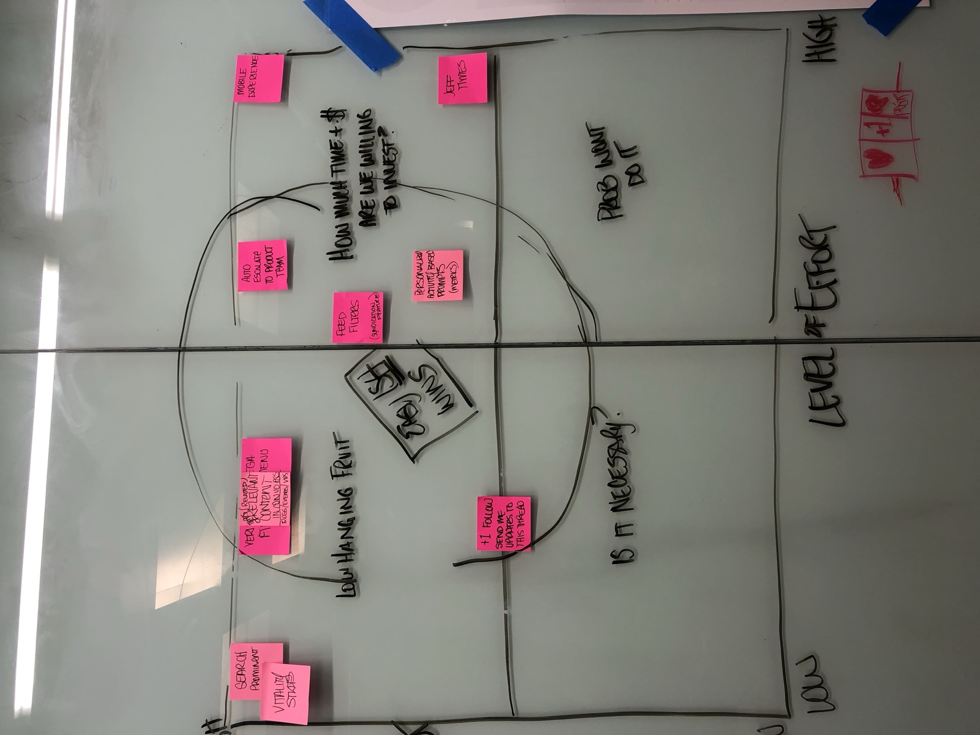
We plotted ideas on impact versus effort to separate the "must do" from the "nice to have," and to surface the one critical disconnect the research kept pointing at: authenticated users had no way to see what was relevant to them. That became the thing to solve first.
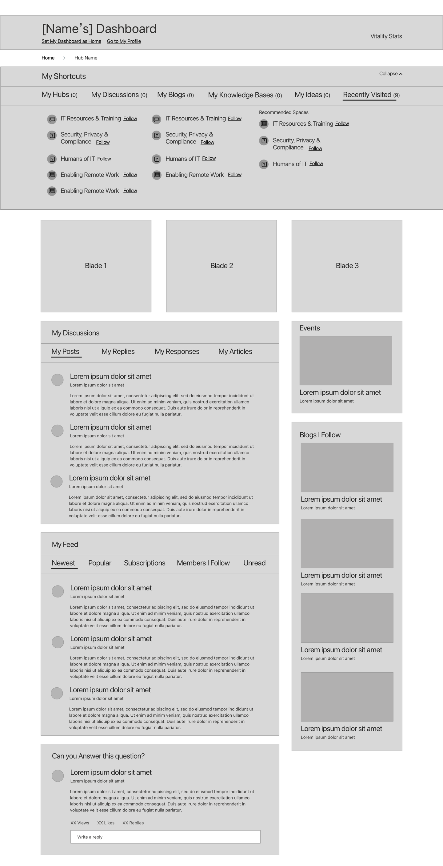
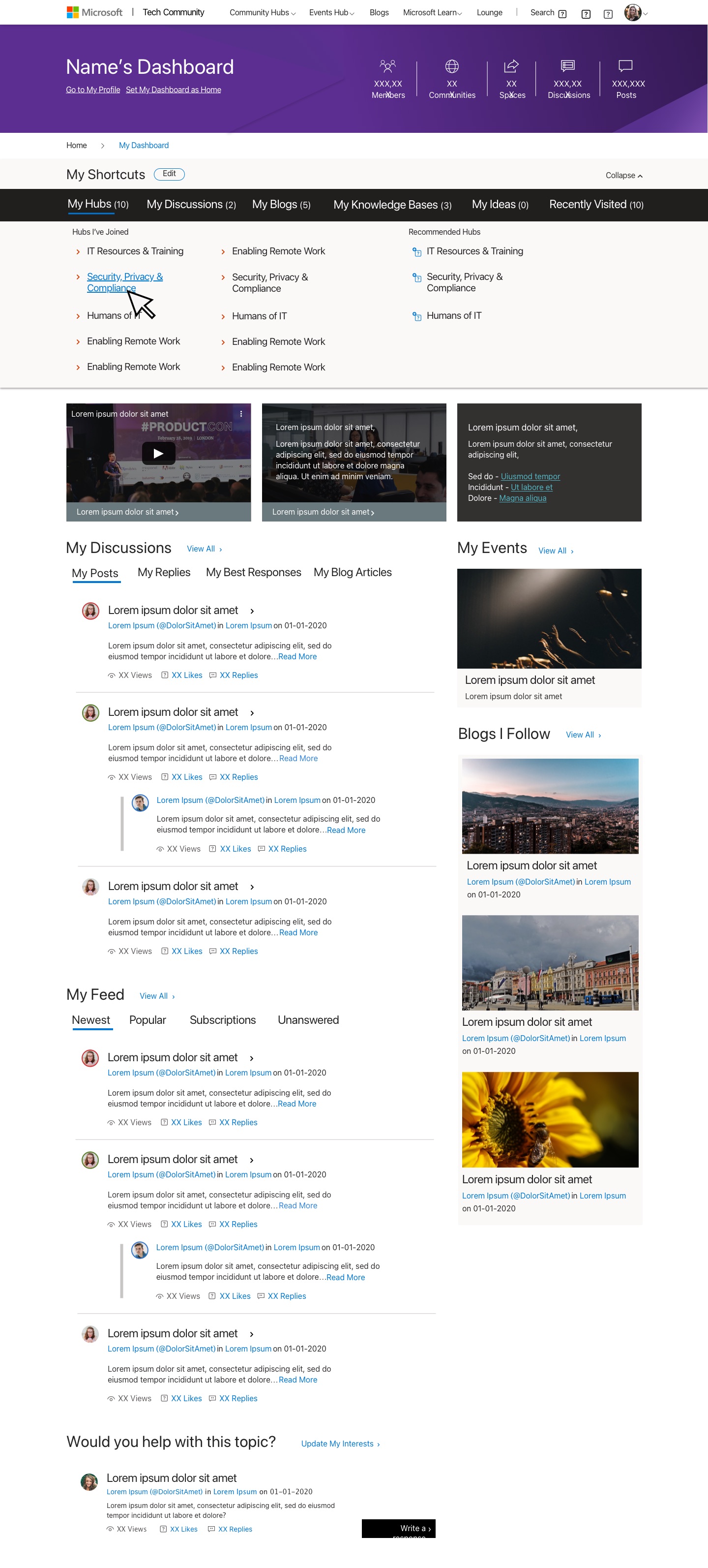
In two days we designed and user-validated a high-fidelity wireframed prototype — community hubs, mega-menu navigation, a personalized dashboard, and clearer calls to action. Enough fidelity to test the wayfinding and personalization bets with real members, fast, before anyone over-built the wrong thing.
“I want to see what's relevant to me — everything else is mostly noise.”
Ned Pyle, PM, Windows Server Community · The line that became the design north star
The Outcome
 4
Research archetypes
Journey maps and skill-and-affinity radars grounding every decision
4
Research archetypes
Journey maps and skill-and-affinity radars grounding every decision
 2
Days from concept to a validated hi-fi prototype
Tested with real community members
2
Days from concept to a validated hi-fi prototype
Tested with real community members
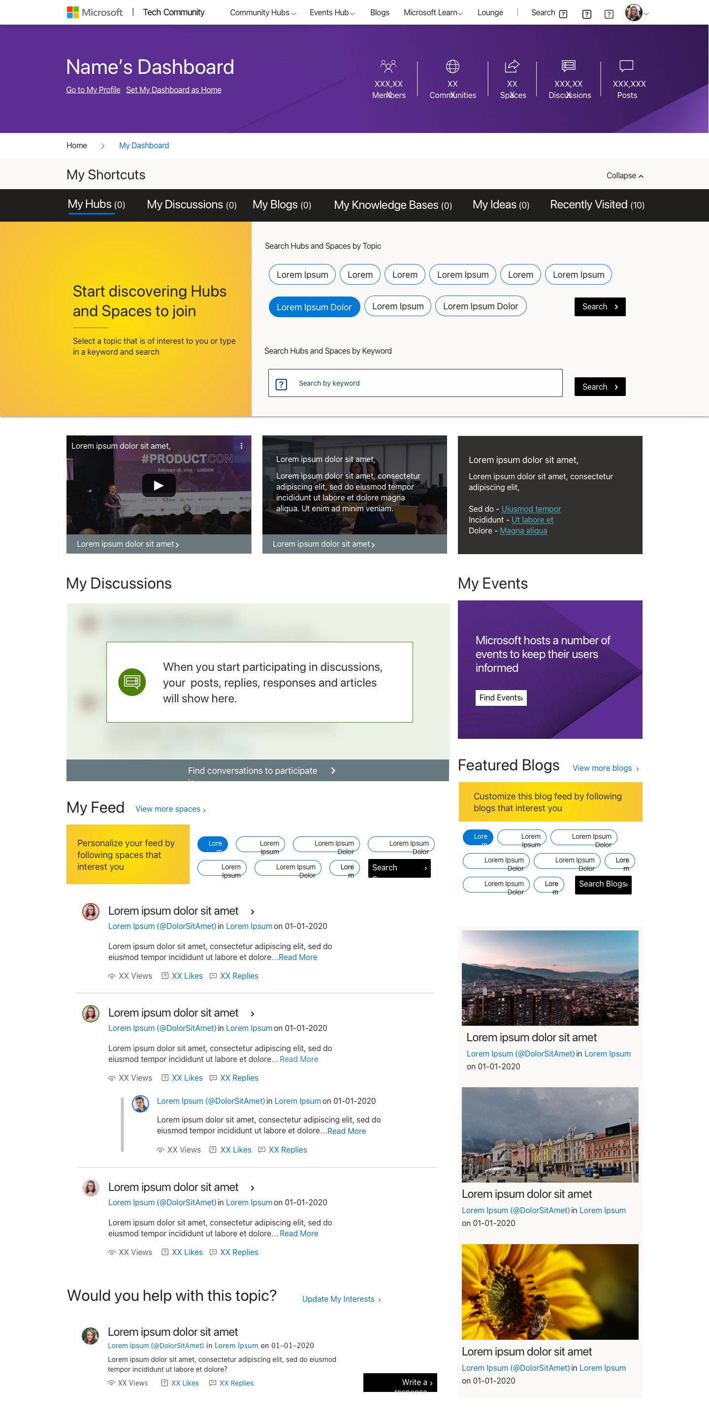 1
Personalized dashboard, designed for desktop and mobile
Community hubs, mega-menu nav, and relevance-first content
1
Personalized dashboard, designed for desktop and mobile
Community hubs, mega-menu nav, and relevance-first content
What Made It Work
Four archetypes with real journeys meant we designed for Chris, Carly, Ramona, and Sam — the skeptic, the newcomer, the influencer, and the sysadmin — not an average that describes no one. You can't personalize a community until you know who you're personalizing it for.
The fix was never more content — it was structure. Community hubs and mega-menu navigation gave members a mental model, so the relevant thing was always a glance away instead of buried three clicks deep. Structure is what turns "everything" into "what I need."
Two days to a high-fidelity prototype, validated with real members, kept the team from confidently building the wrong thing. High fidelity where it de-risks the bet; speed everywhere else.
Selected Artifacts